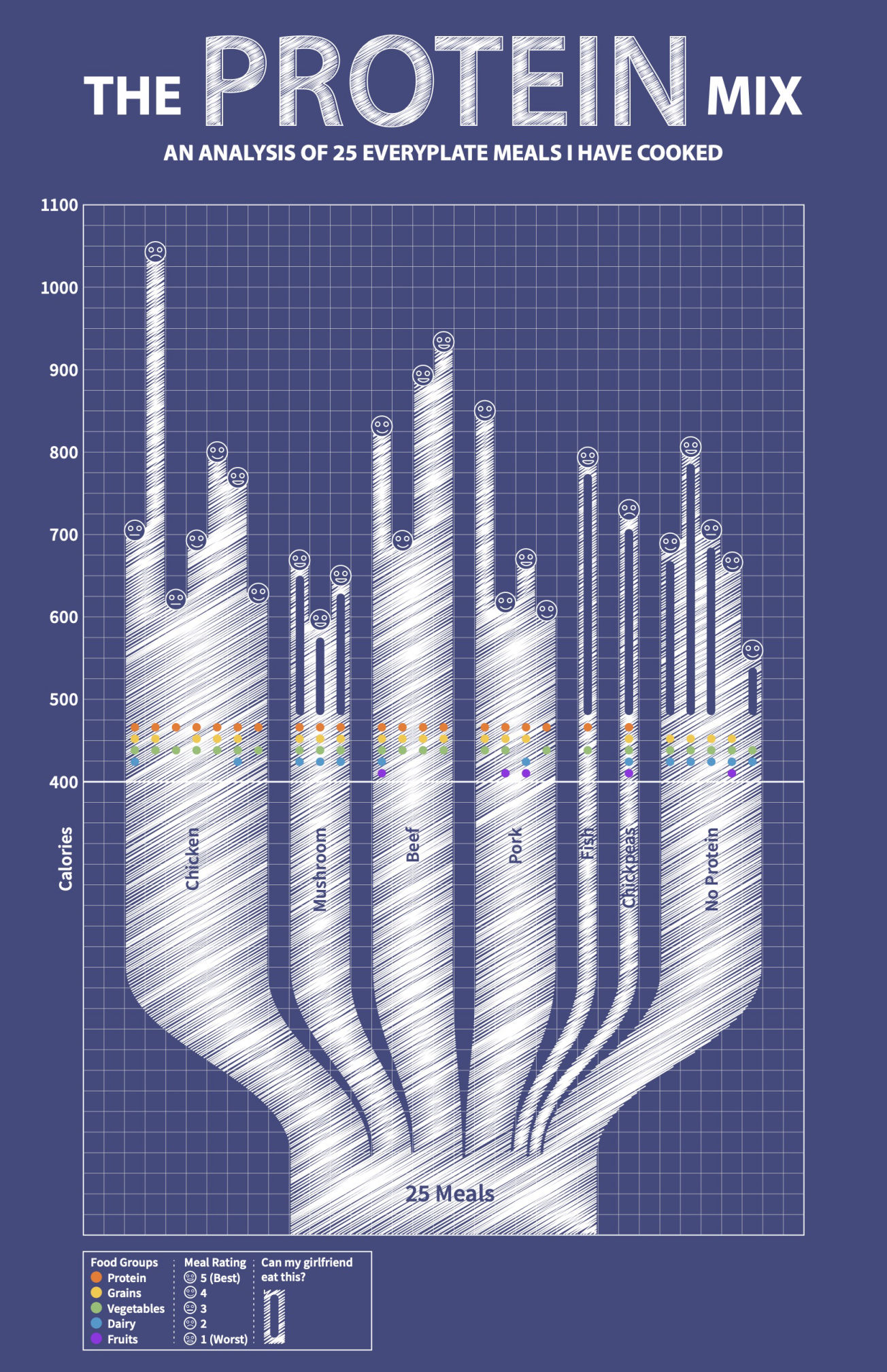
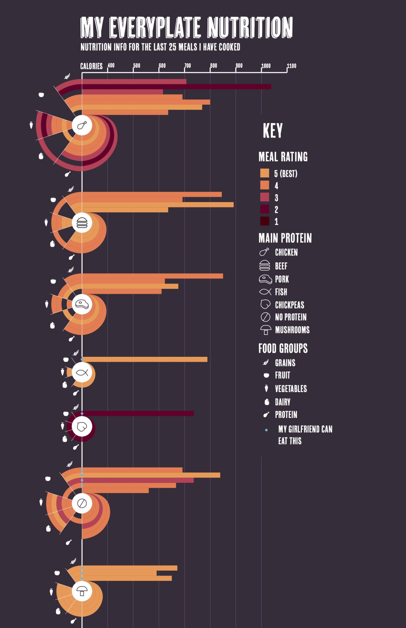
For this project, I represented 25 of the more recent meals I had cooked from my EveryPlate subscription.


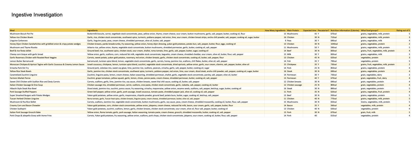
This project had me designing a series of data visualizations based on information I collected. I used food information from 25 of the most recent meal kit meals I had cooked.
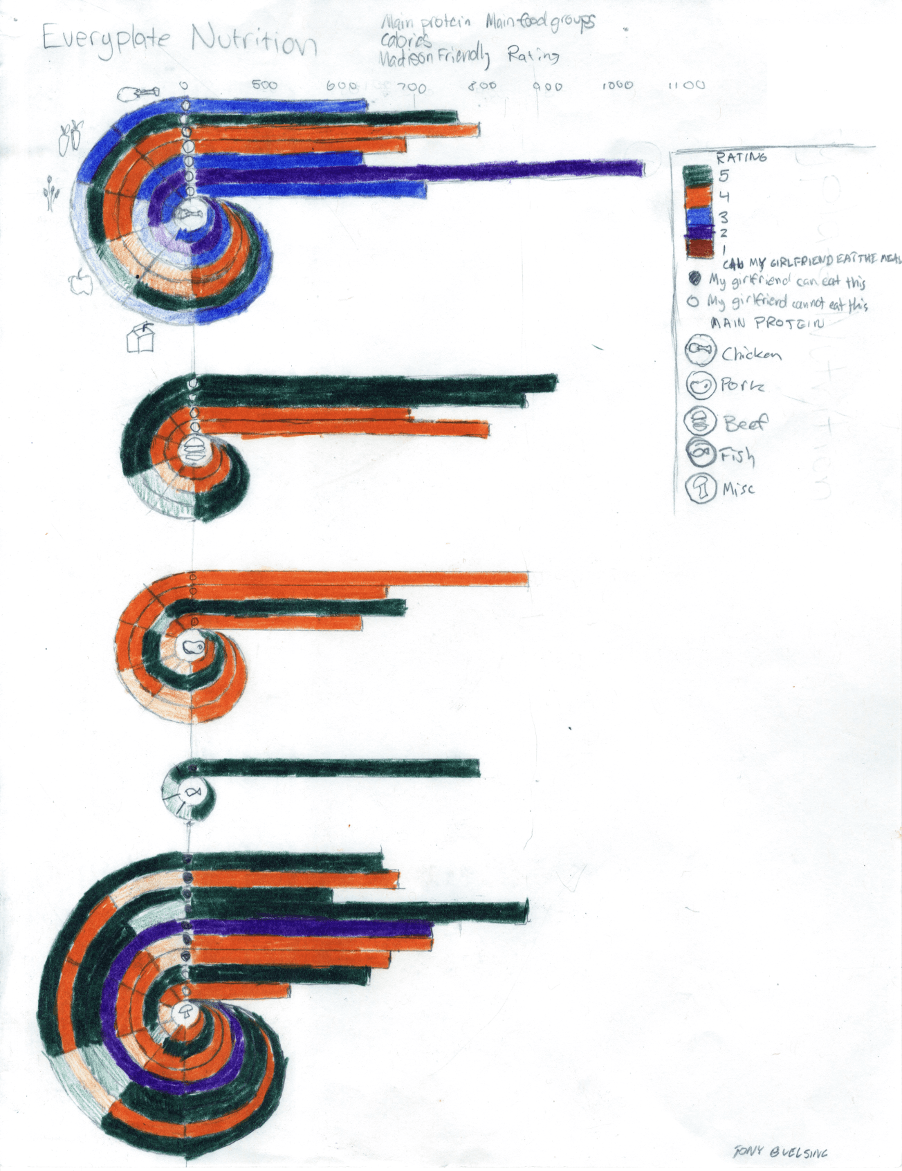
I explored a variety of approaches to visually show my dataset, ranging from the food pyramid to a homebrewed "snail graph".
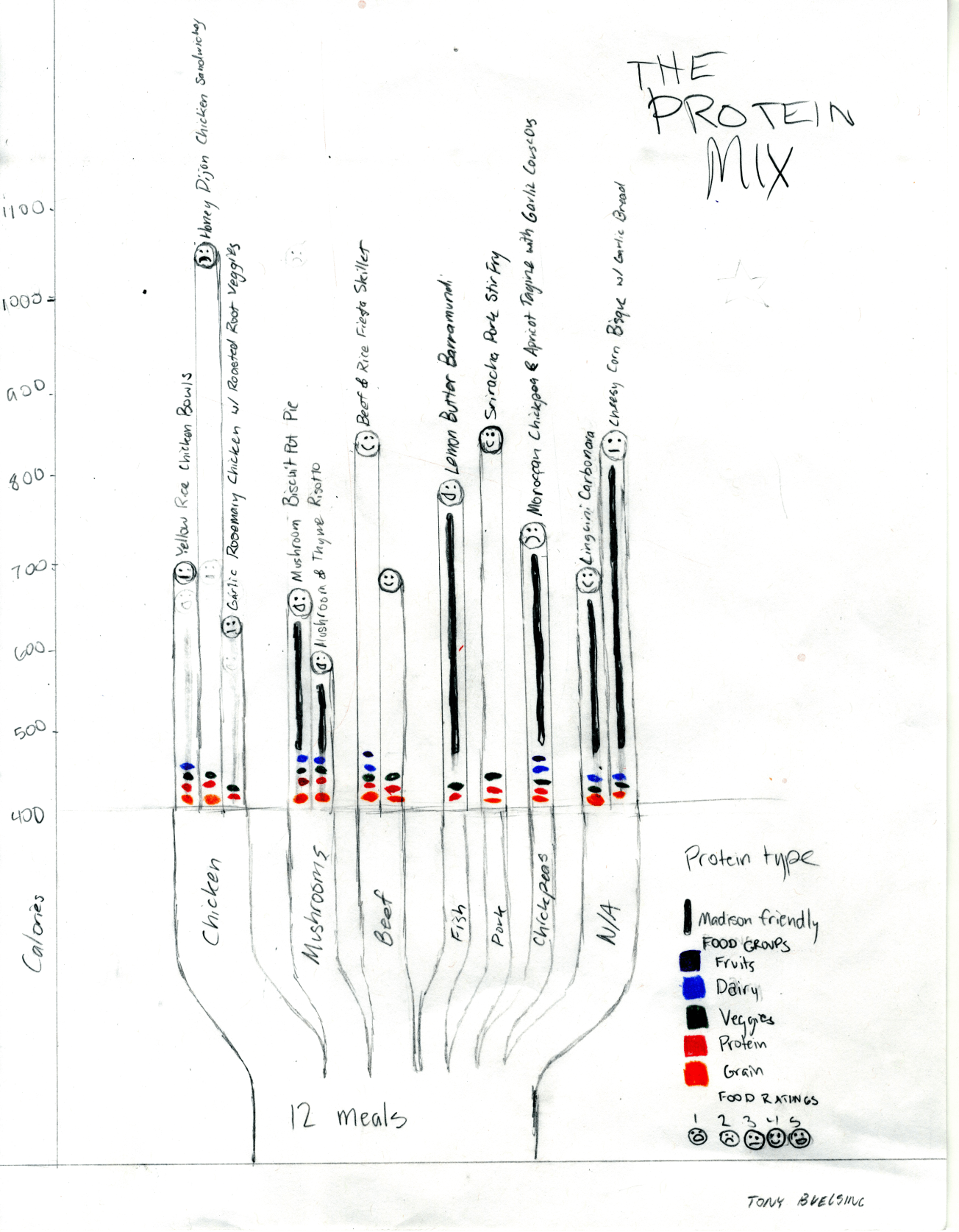
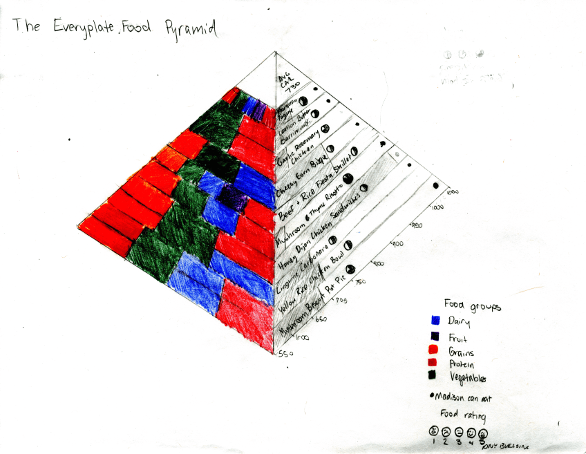
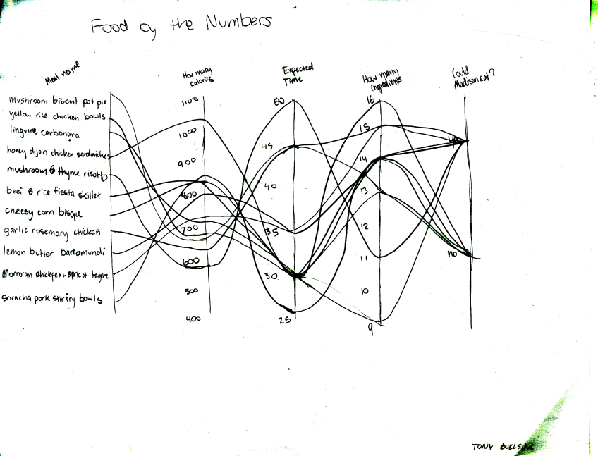
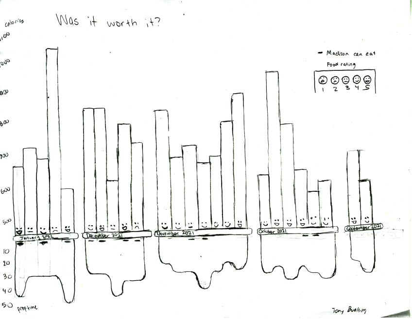
After critique, I re-created my three most impactful (according to my peers) designs in the digital space. Before I added color, I wanted to get the layout, fonts, and structure right so I could just focus on aesthetics later.
A notable change I made at this step was to remove the Calories data points from the "Was it Worth It?" chart, as I felt that it could send a negative message about our relationship with food that I wasn't intending.
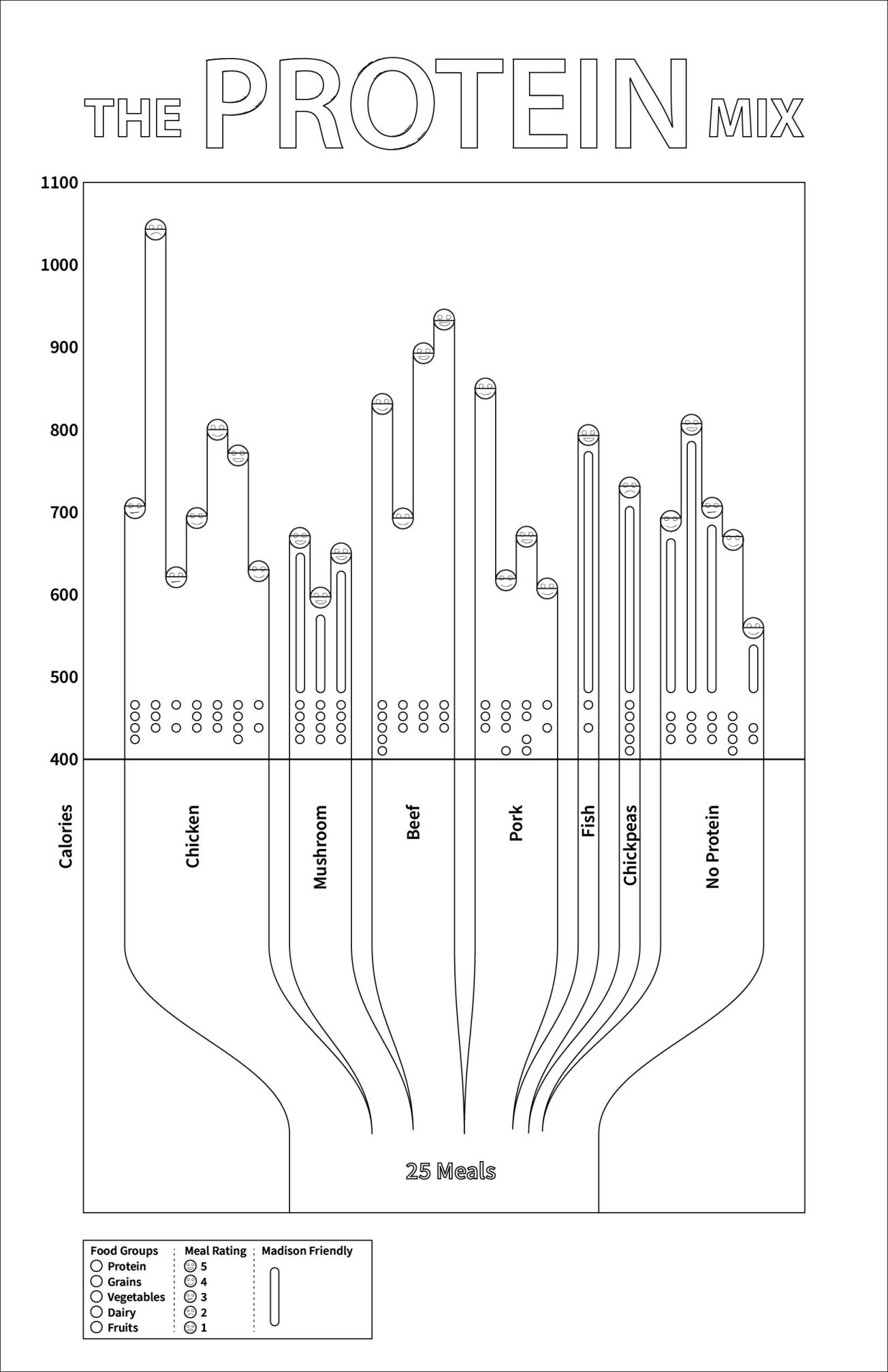
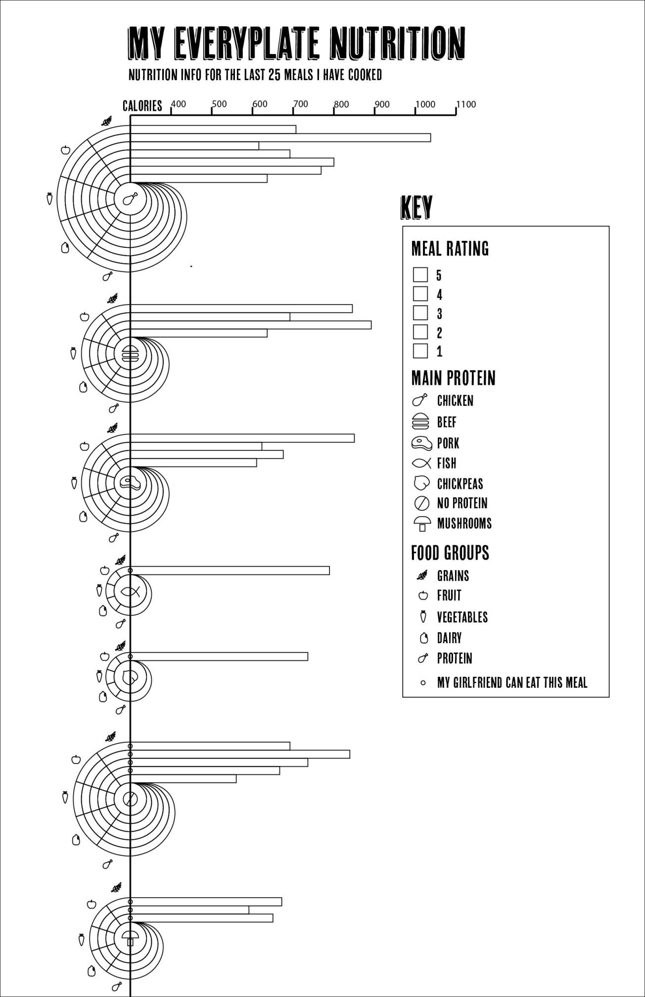
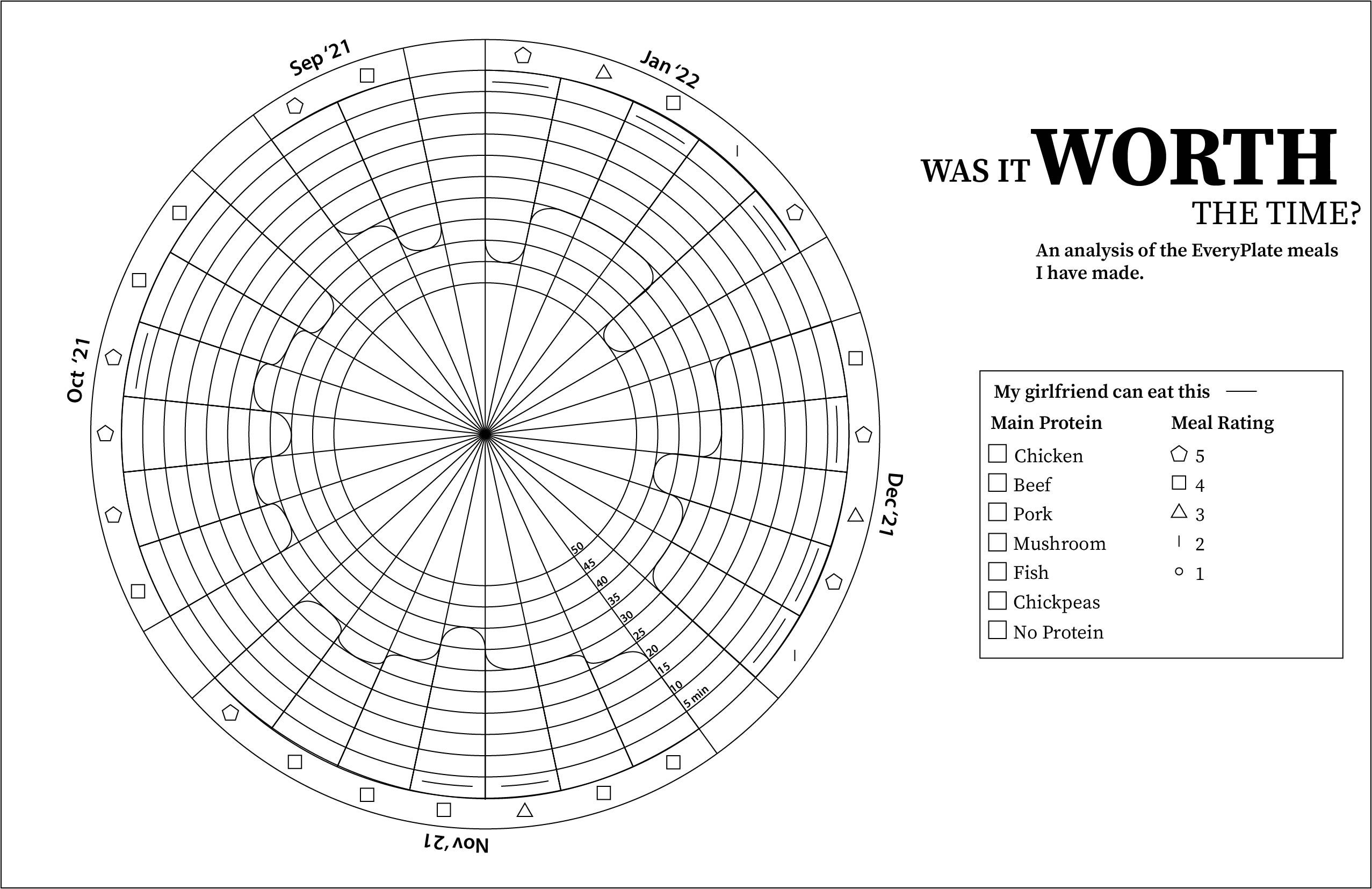
Because I did a good job thinking ahead in the previous step, this step went quickly. I had a mental image for much of this in advance, so it was just a process of bringing those ideas to life through color and texture. There are still several issues at this point.
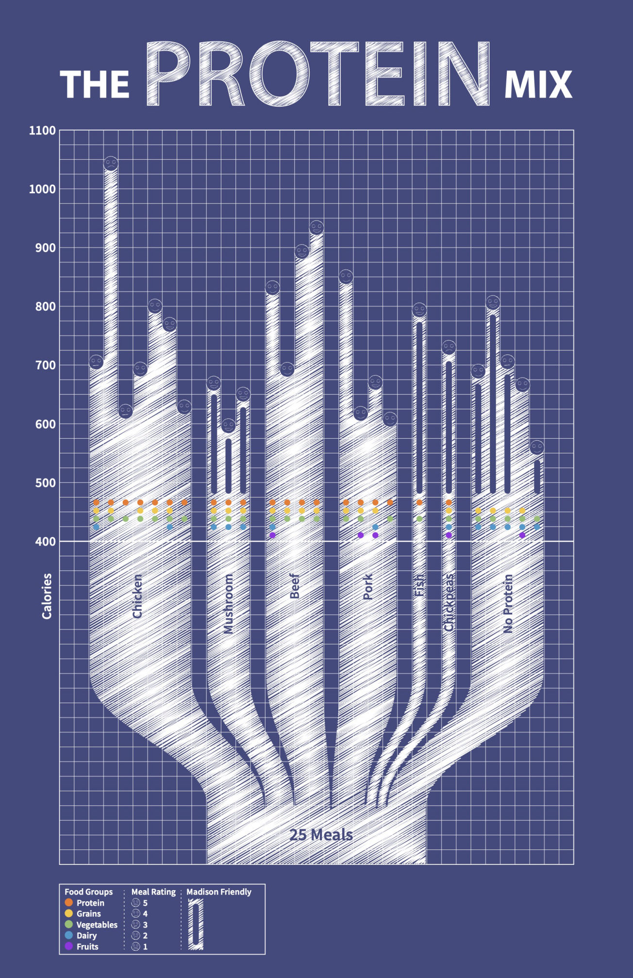
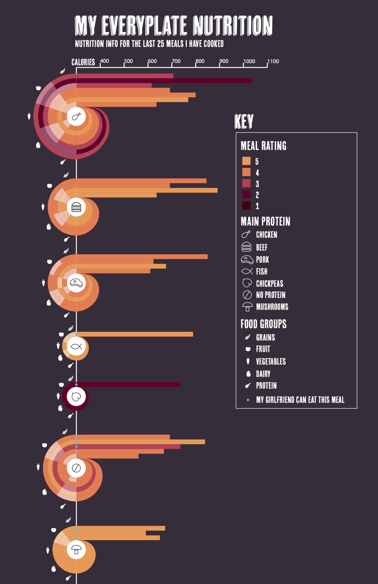
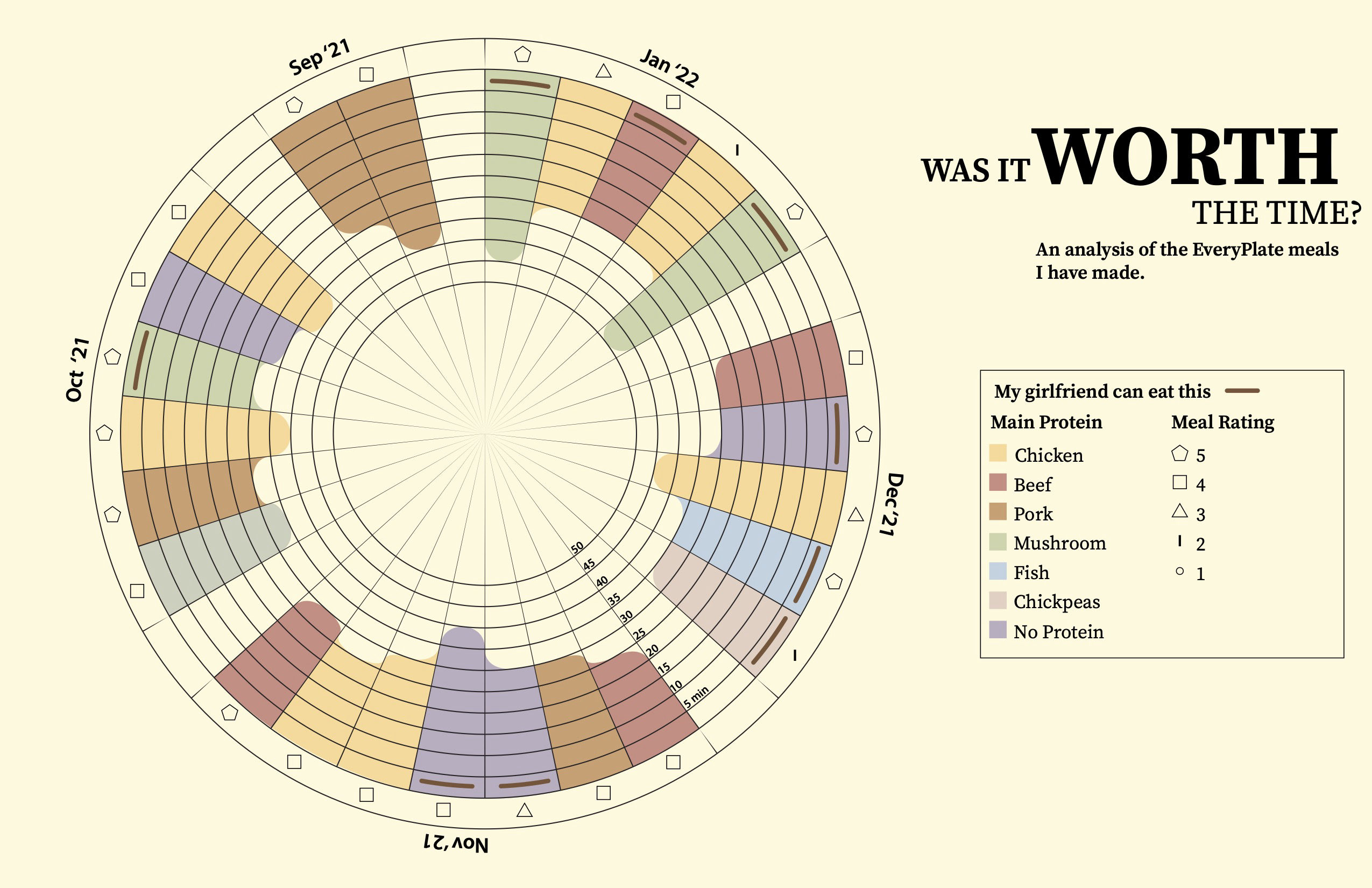
My visualizations were complete and it was time to focus on editing and clarity. I edited keys, changed the faces in The Protein Mix for clarity, added subtitles to explain what I was tracking, separated the food groups and removed the shapes outright for unrepresented food groups in My Everyplate Nutrition. In Was it Worth It, I removed the columns not used, switched from icons to numbers for the ratings, and distributed row labels around the graph for clarity.


