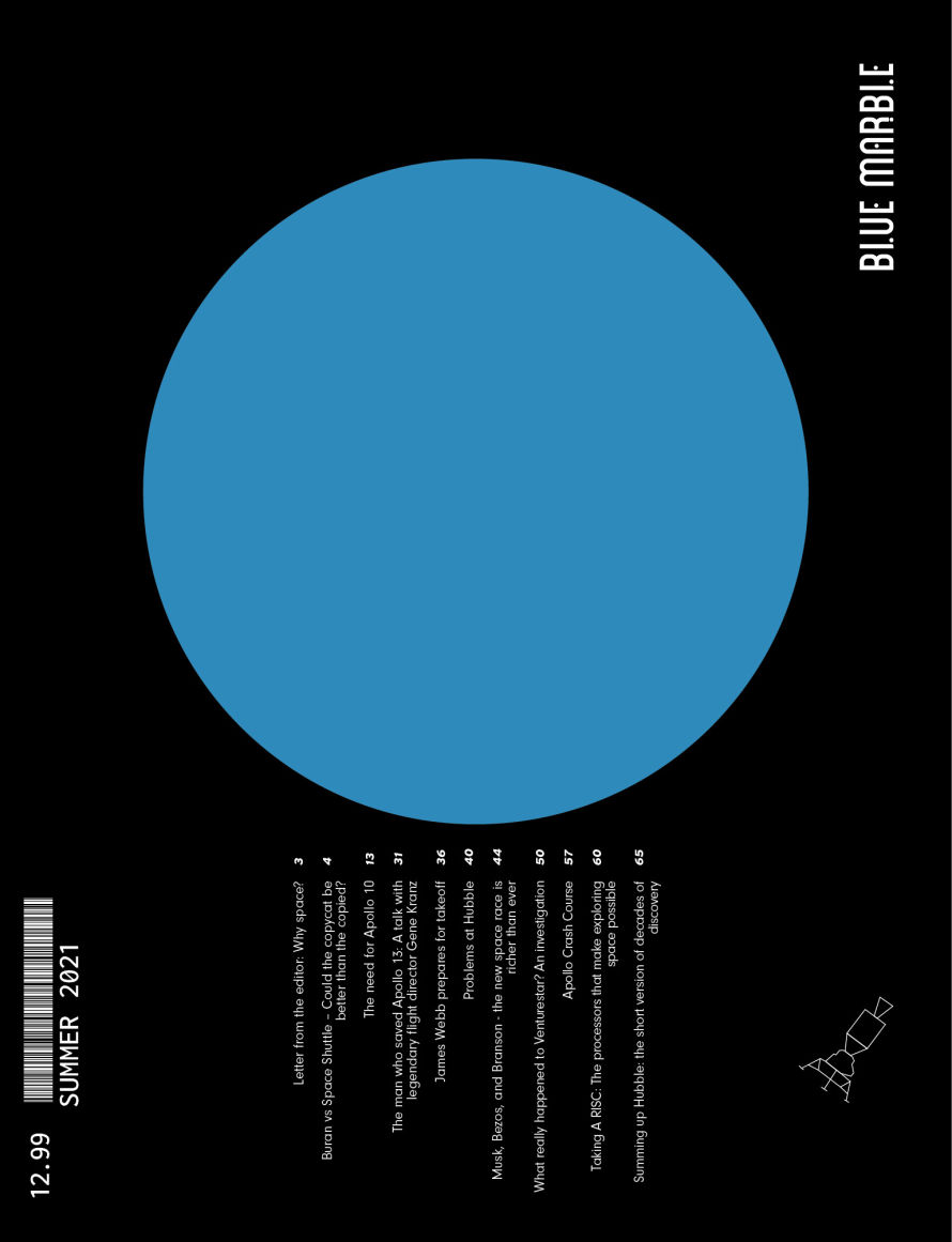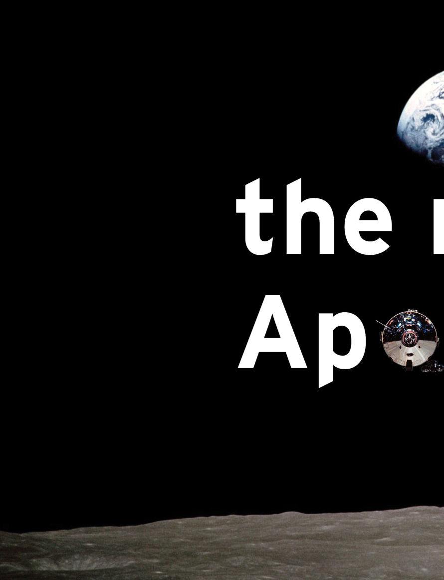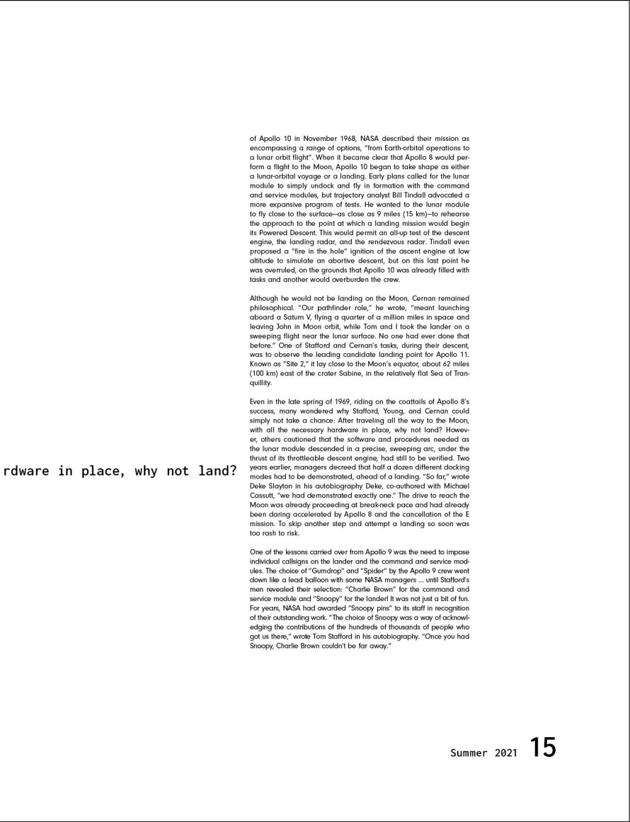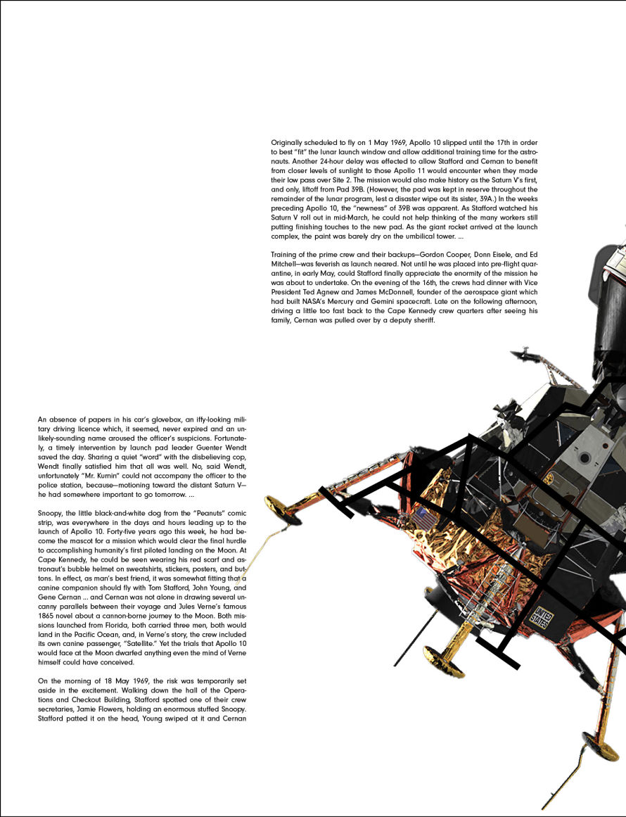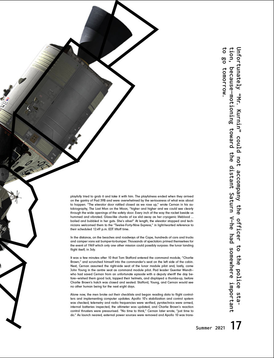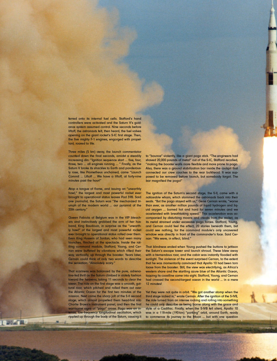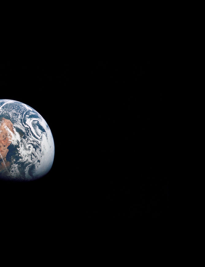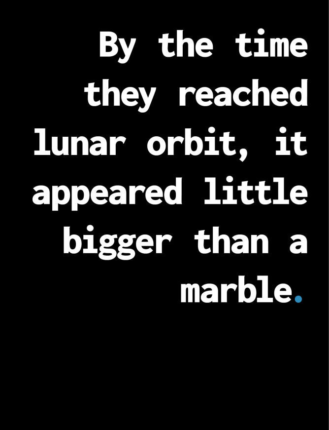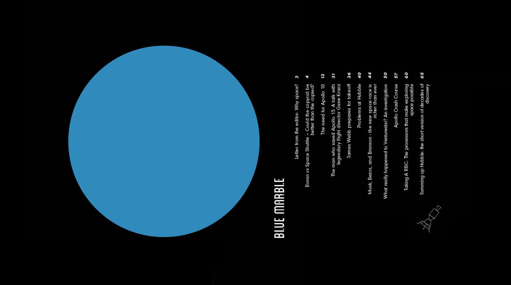

Blue Marble is a scientific publication covering everything happening outside Earth's atmosphere. The name is inspired by a famous photo taken by the crew of Apollo 17 on their way to the moon.
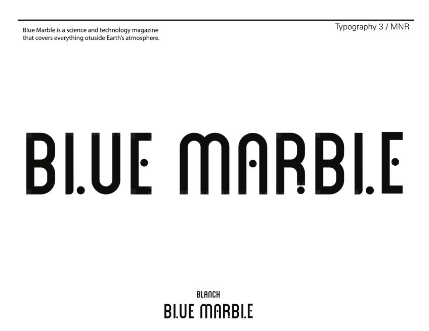
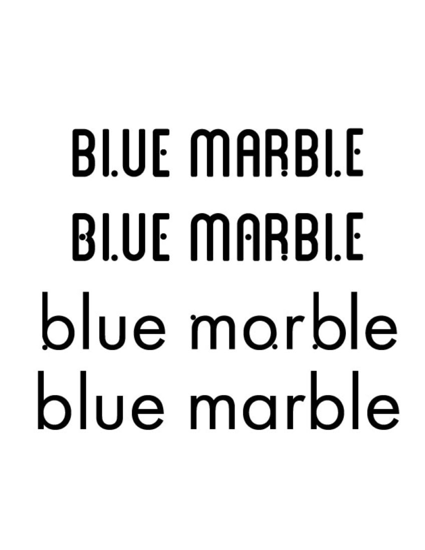
I wanted to develop a logo and identity reflecting the technicality that goes into spaceflight, but also show some of the humanity of those that make it happen.
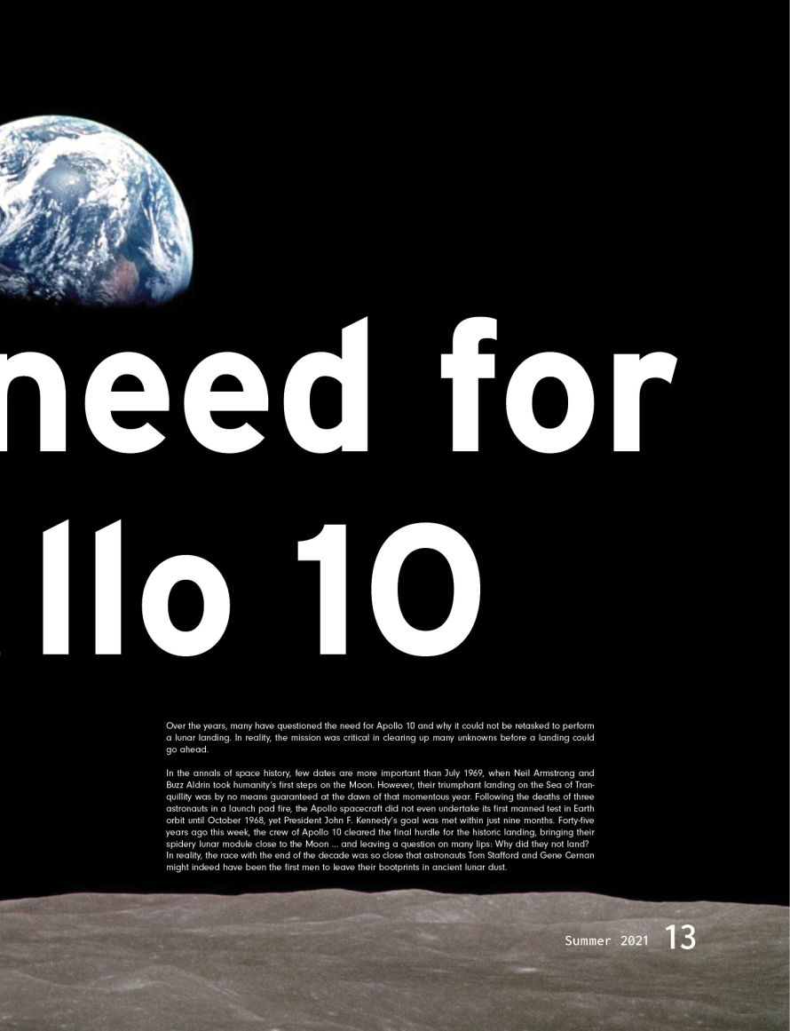
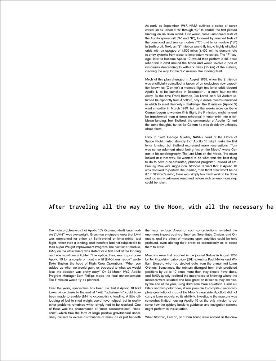
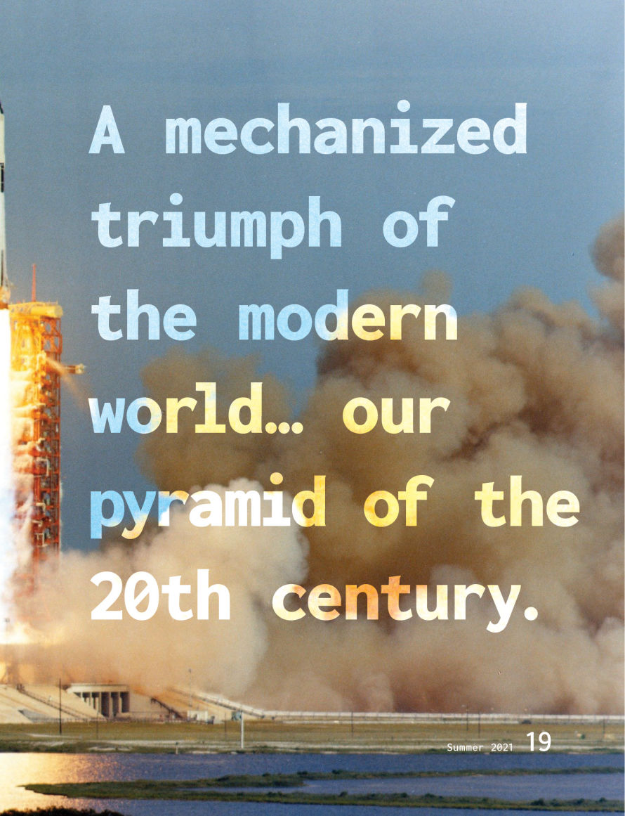
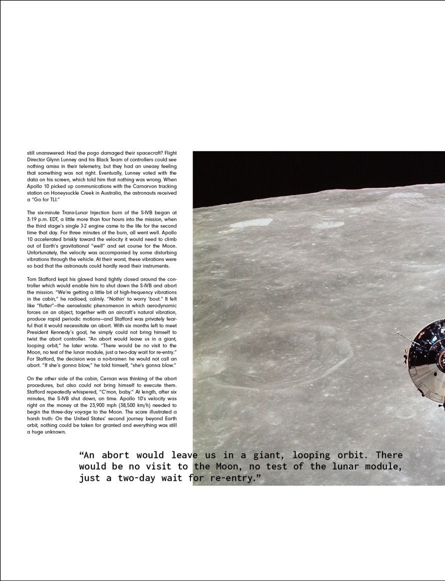
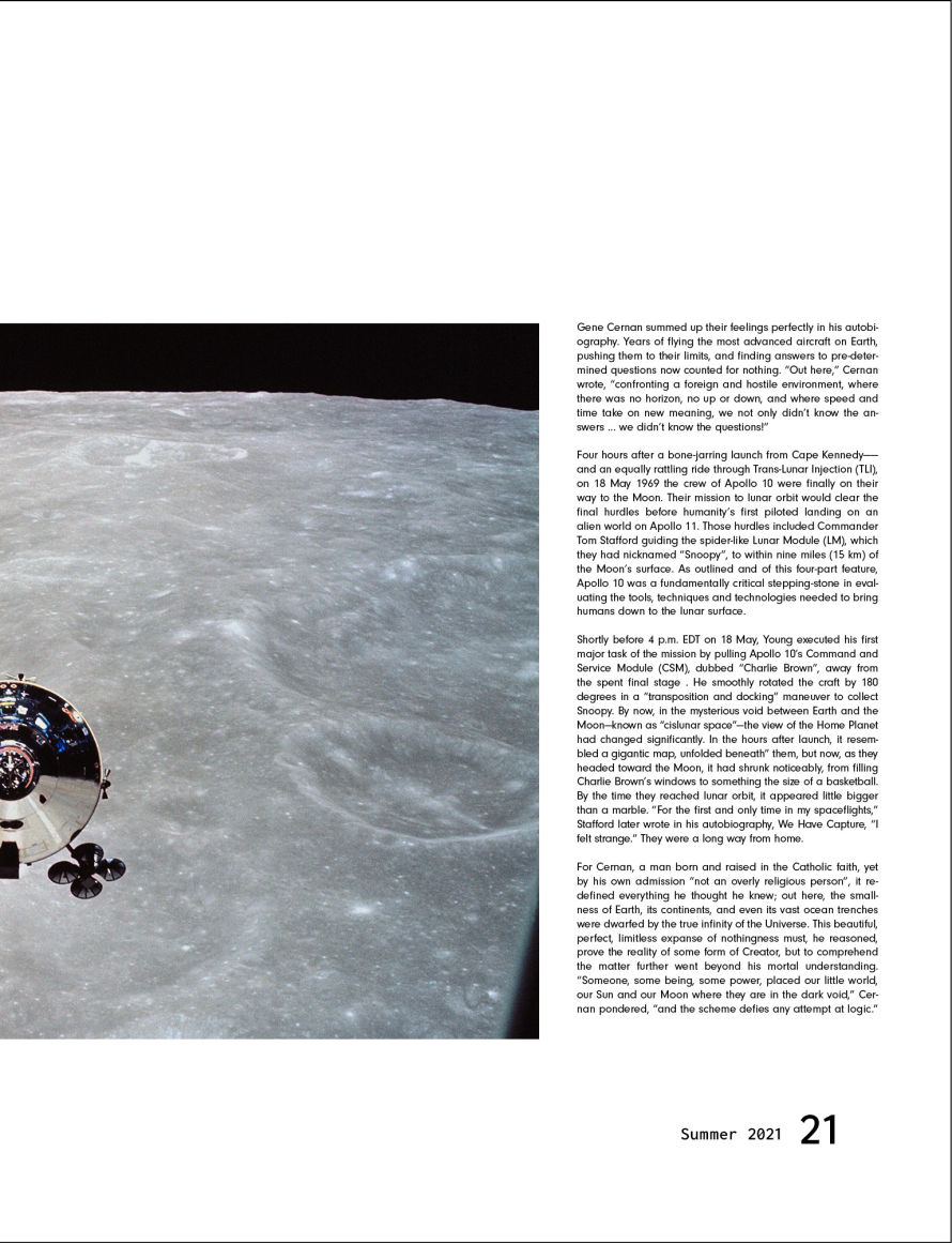
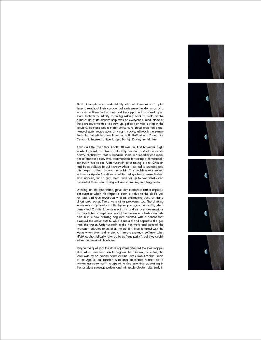
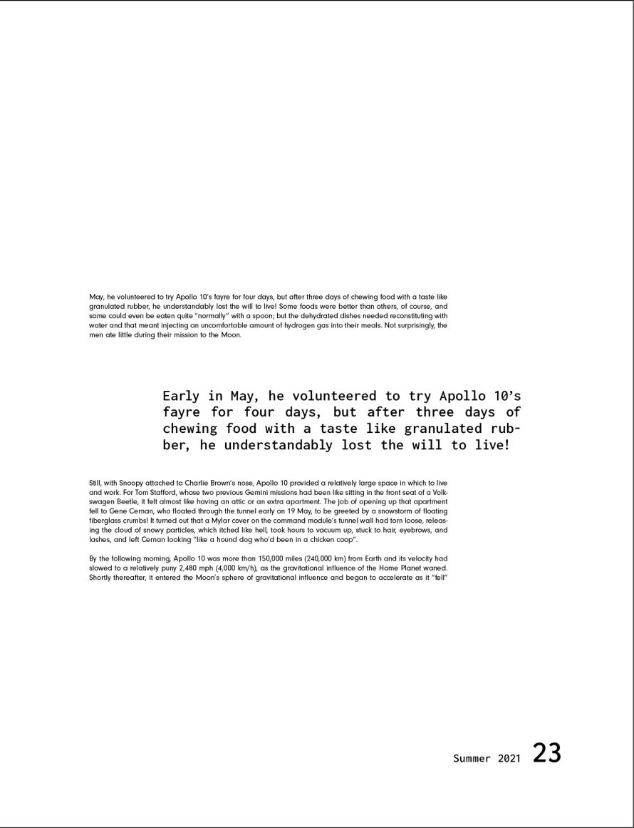
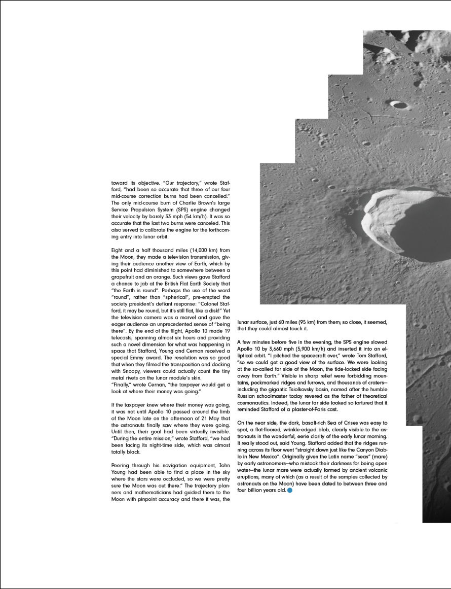
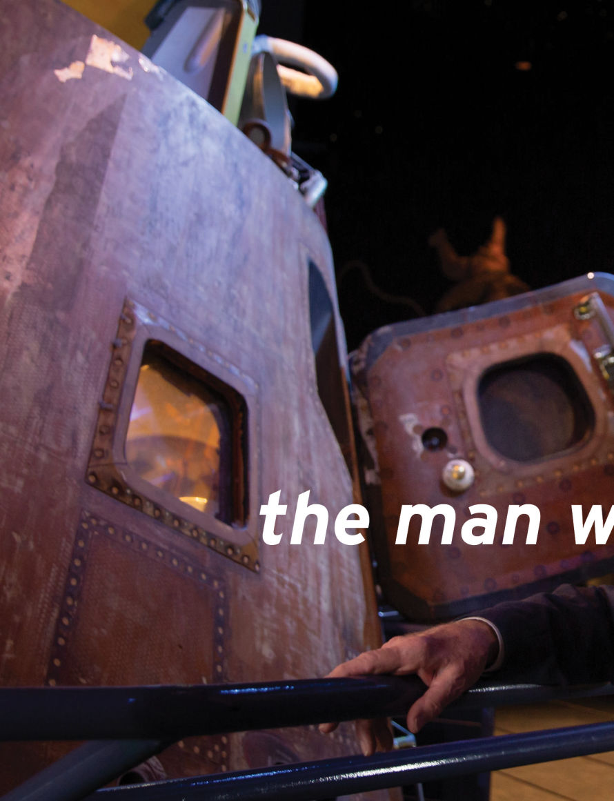
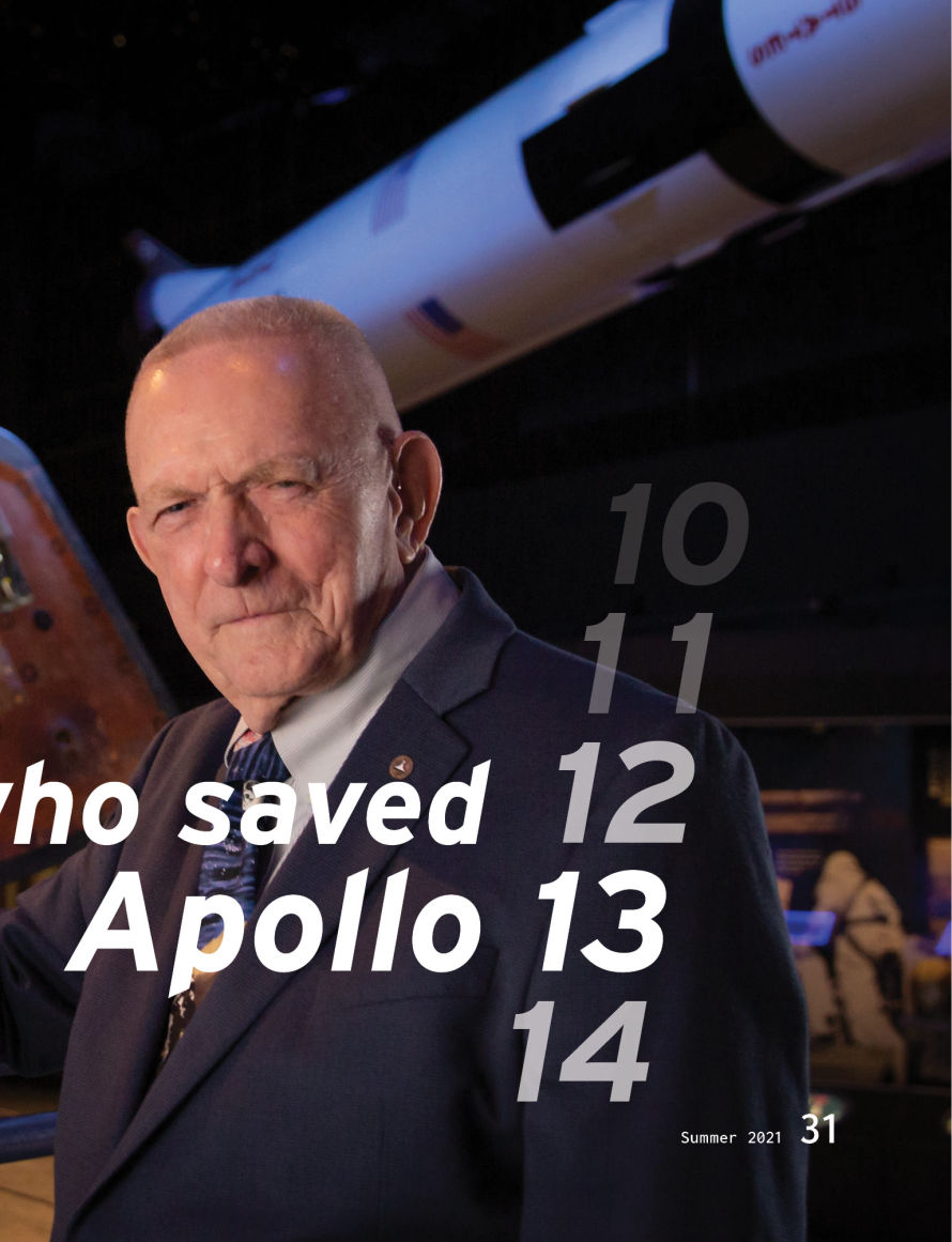
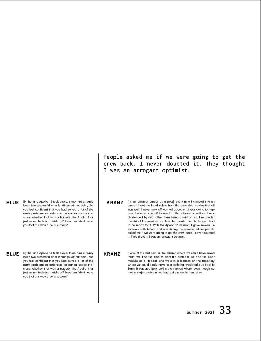
The design of this magazine is heavily inspired by midcentury design and elegant, functional white space. Additional characteristics include the very large paper size - the same as LIFE magazine - and the use of foldouts to make absolutely huge statement pieces.
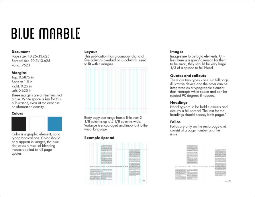
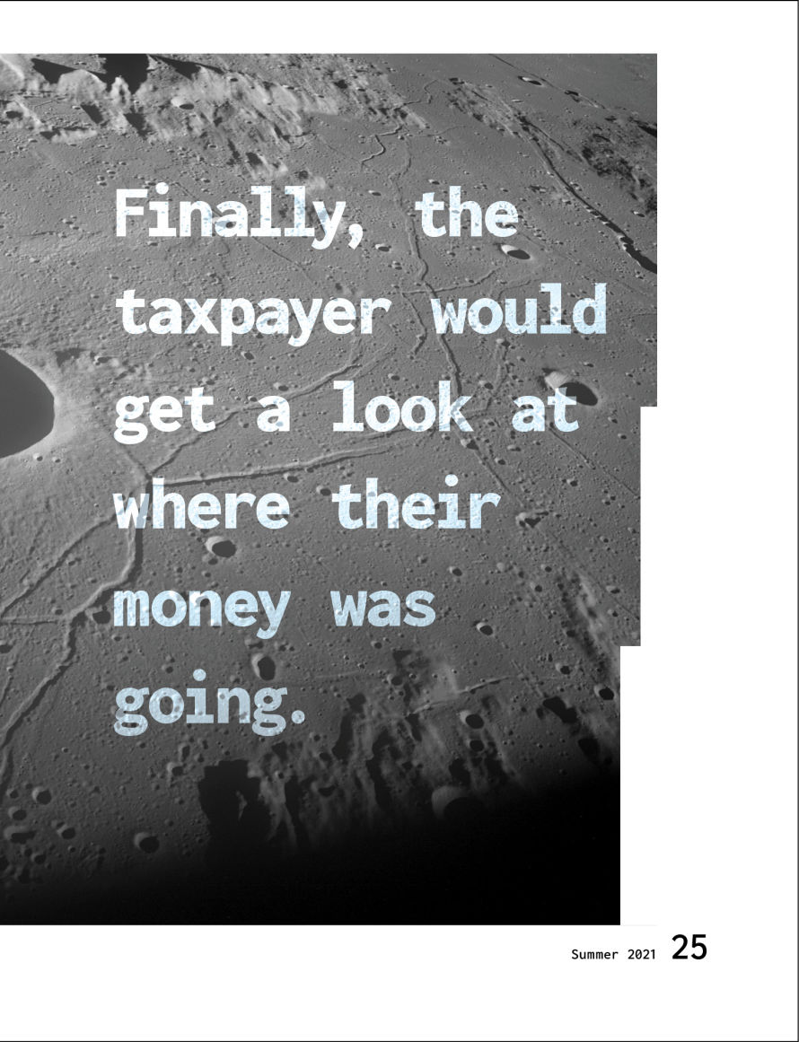
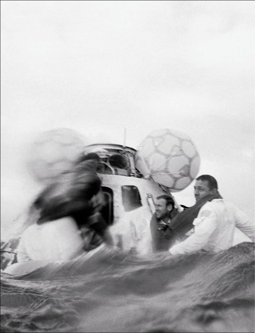
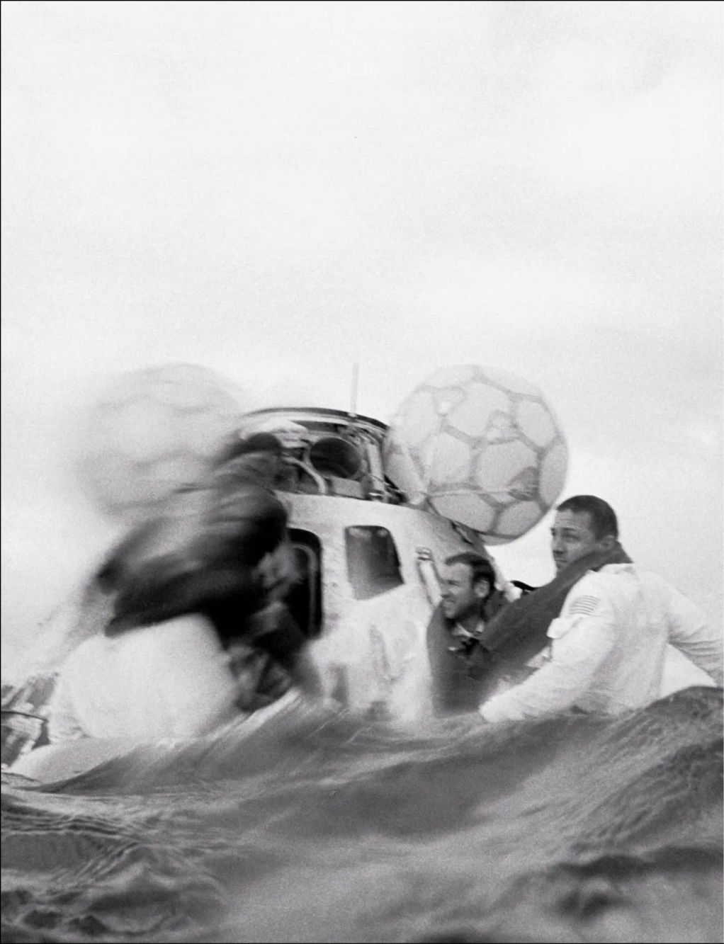
When designing these layouts, I was inspired by a special Moon Landing edition of Life Magazine my girlfriend found at an antique mall. I loved how the pictures' size gave so much weight and visual impact, so I made the paper size for my publication huge and gave images a lot of impact. All images are either huge or tiny.
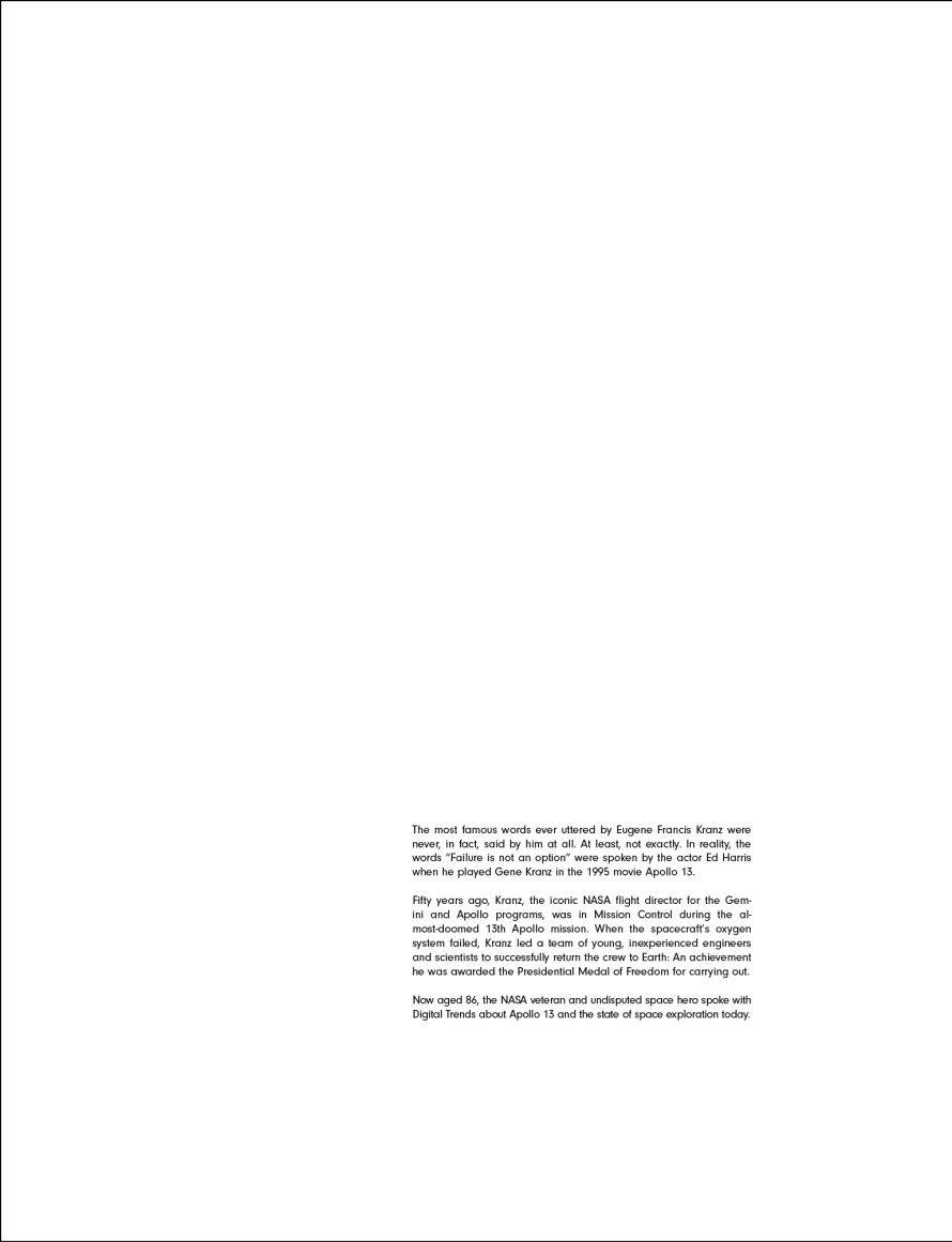
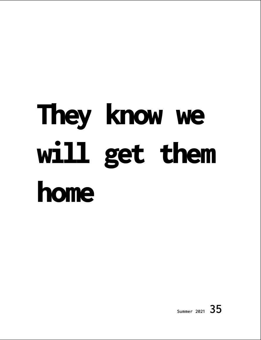
Because this publication is about space, I let myself be guided by midcentury design principles. I also added white space as its own design component, not merely the lack of something. Because there is no such thing as up or down in space, I also allowed quotes to be oriented vertically as well. Foldouts are used to show effect with this huge paper, and to make a collectible poster with each issue.
